Crafting Excellence in Software
Let’s build something extraordinary together.
Rely on Lasting Dynamics for unparalleled software quality.
Michele Cimmino
Apr 26, 2023 • 4 min read
Design systems have become an essential asset for any design or development team, they became a key element for all sizes and industries with a digital presence and not only tech companies. Design systems provide a single point of reference for digital design, including guidelines, components, etcetera.
This article will outline the Lasting Dynamics team's way of creating and organizing our Design System. We will use some of our internal objects, as an example and describe them step by step.
But before enrolling in the steps, we should know what’s a design system? and how does it help?
A Design System is a well-structured set of shared and integrated patterns and principles that define the product and help teams design and build consistent and cohesive digital solutions. It helps teams work faster and more efficiently by providing a shared language and a set of reusable components and patterns. This is where new arrivals in the project can learn how to develop further elements and find specifications to understand and implement them.
The main goal of a design system is to improve the efficiency, quality, scalability of design and development work. It helps teams scale design and development efforts by providing a framework for building and maintaining digital products over time.
Design systems are a powerful tool to simplify and boost the work within a team but it requires careful planning and execution to be effective.
Here is how we organize our Design system in Lasting Dynamics: as it should be, our design system is composed of 2 main sections:
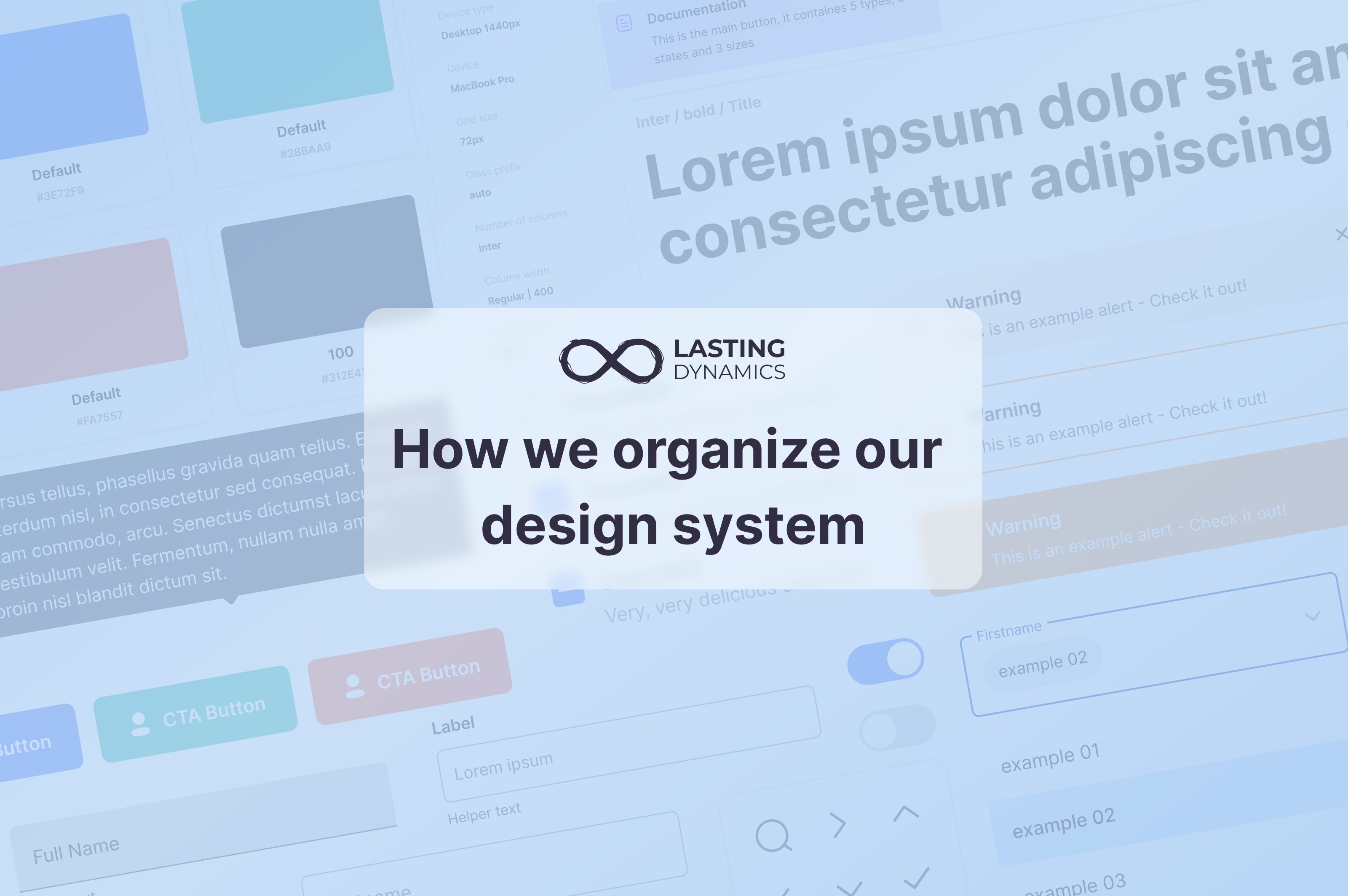
In this section, we described the most principal parts: Colors, Typography, Icons, Spacing, Grid and Shadow as shown in the view

In addition to a General section that contains all general components used to display items in the pages like the Header, Colors box, Documentation box, etcetera. These items allows to organize our pages and components so any new member in the team can integrate easily. For example, we have the documentation box that is used to add documentation about the component regarding its elements, states, sizes or types, or also the explanation arrows that are used to point the margins, the paddings or the any details inside the component’s anatomy.

Since our design system is more general and not project related, we made sure to include more examples and options in each part for better use in the future.
Let’s build something extraordinary together.
Rely on Lasting Dynamics for unparalleled software quality.
Each component of these has an individual page divided into 4 main points or aspects, we will explain each aspect with an example of the Switch component from our Design System :


A good approach is to create an instance and test the component with all possible cases to understand how it is used, and make sure to do a review about it -following our review process- and report any bugs found.


After performing our tests on the component, if the component is validated, that means that it is ready to be used and published.

Here are some tips we prepared to help you create components:
Our team understands that every product is evolving and growing, and the Design System is a crucial part of any project, that’s why keeping it up to date with the changes for the Identity is the key. By working with components we ensure the possibility to publish changes on styles, colors, components, and other assets from the System in a matter of minutes, showing up on every Figma file where the Design System is synchronised.
Still, making many updates in short periods of time is not a good move, each improvement should be discussed between the team and proposed in ideation pages of a master file and a documentation related to this change should be announced to the team. That way, everyone is conscious of the possible improvements, how to use it and can propose suggestions.
With the latest Figma releases, it is more easier to publish your changes and keep track on those changes from any other fact. In fact, it is possible now to apply the changes on some components and the others will keep the other version, this way Figma gives us more freedome to manage our components and changes.

Transform bold ideas into powerful applications.
Let’s create software that makes an impact together.

Michele Cimmino
I believe in hard work and daily commitment as the only way to get results. I feel an inexplicable attraction for the quality and when it comes to the software this is the motivation that makes me and my team have a strong grip on Agile practices and continuous process evaluations. I have a strong competitive attitude to whatever I approach - in the way that I don't stop working, until I reach the TOP of it, and once I'm there, I start to work to keep the position.