Crafting Excellence in Software
Let’s build something extraordinary together.
Rely on Lasting Dynamics for unparalleled software quality.
Michele Cimmino
Jun 19, 2023 • 3 min read
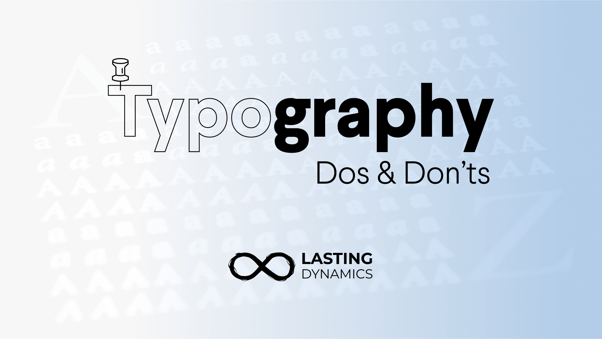
Typography plays a crucial role in User Interface Design as it helps to create a visual hierarchy, improve readability, and convey a brand's personality. Understanding the way typography can impact the overall aesthetic of a design and influence how users perceive and interact with the interface will always provide better products.
Just see the difference 👇

A well-selected typeface can make a design look professional, organized, and easy to use, while poor typography choices can make it look unprofessional, cluttered, and difficult to orientate the users while navigating our products.

Additionally, typography can also affect accessibility by making sure text is legible for people with visual impairments. As soon as designers understand how essential is a typography as a vital component of User Interface Design, the sooner it will help to improve the User Experience and communicate the intended message effectively.
By considering these design criteria & logic, typography can effectively enhance the overall User Experience and help to communicate the intended messages on your products.


➡️ Fonts are powerful resources: in fact, some are specifically made for wireframing, check these two options:
This font has only one weight (circular, rounded or block) or and it’s meant to be a very simplified version for placeholder, it’s really helpful for low-fidelity wireframing in scenarios where we want to give focus to a specific feature or section.

This is the option for the fans of printed wireframing, Redacted Script has three weights and emulates a persons handwriting. It provides a nice look and feel while doing it’s job.

Download Redacted Script by Christian Nahts.
Let’s build something extraordinary together.
Rely on Lasting Dynamics for unparalleled software quality.
☝ Before finishing, the Lasting Dynamics team will show some of our favorite font families to work on digital interfaces:

Download Inter by Rasmus Andersson.

Download Larsseit by Nico Inosanto.

Download Circular STD by Laurenz Brunner.

Download Berthold Akzidenz Grotesk by Ferdinand Theinhartd.
Transform bold ideas into powerful applications.
Let’s create software that makes an impact together.

Michele Cimmino
I believe in hard work and daily commitment as the only way to get results. I feel an inexplicable attraction for the quality and when it comes to the software this is the motivation that makes me and my team have a strong grip on Agile practices and continuous process evaluations. I have a strong competitive attitude to whatever I approach - in the way that I don't stop working, until I reach the TOP of it, and once I'm there, I start to work to keep the position.